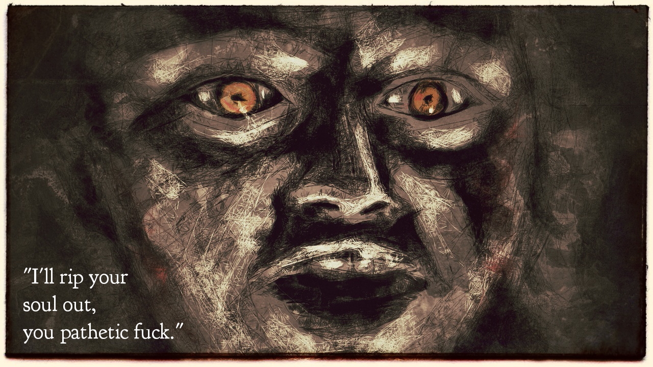
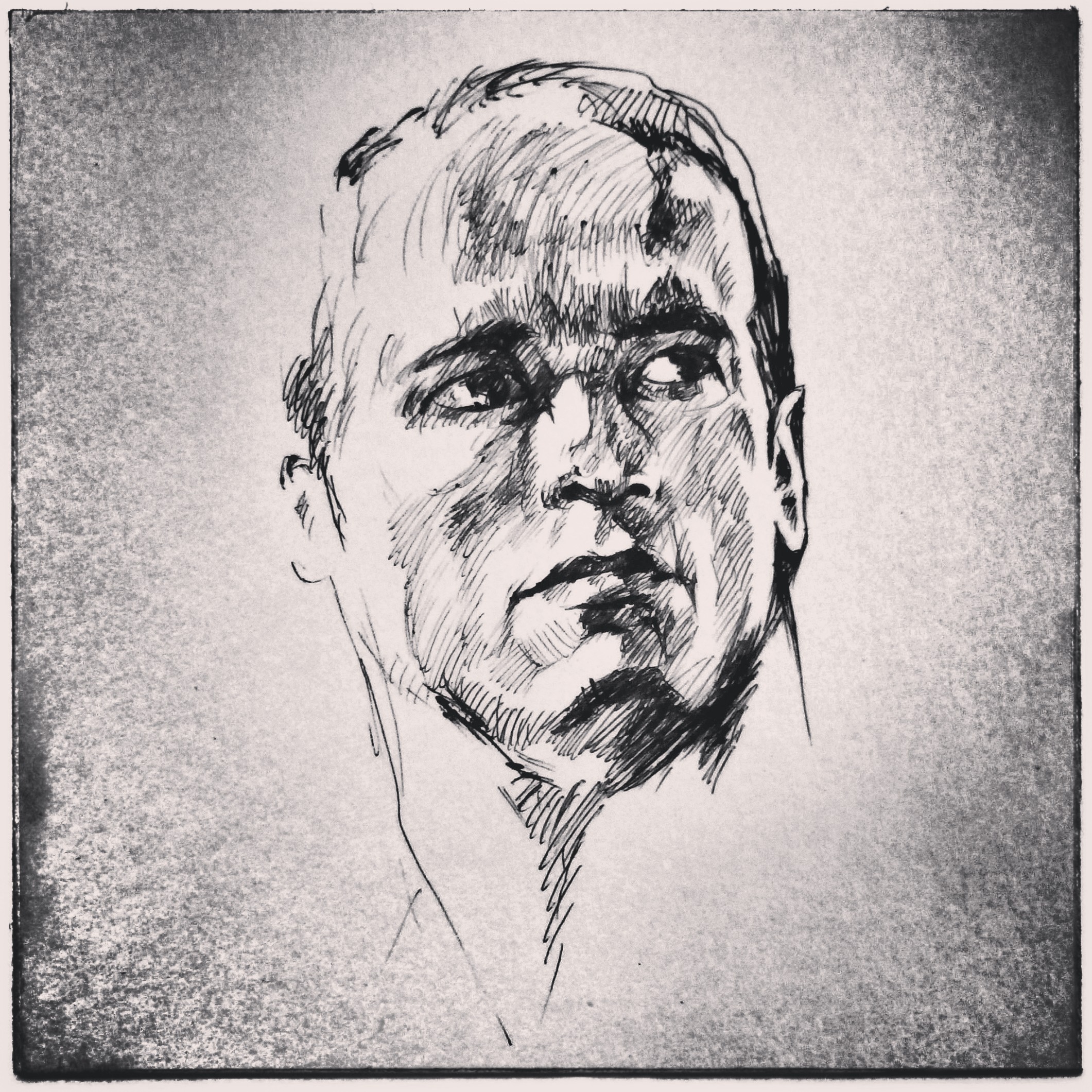
Recently, a trailer for The ABCs of Death was released, and it looks great. Related to that is a drawing of mine that I wanted to post. Keep in mind, that this is a year old, but I never wrote in detail about it, so I’m posting it now. Explanation will follow.
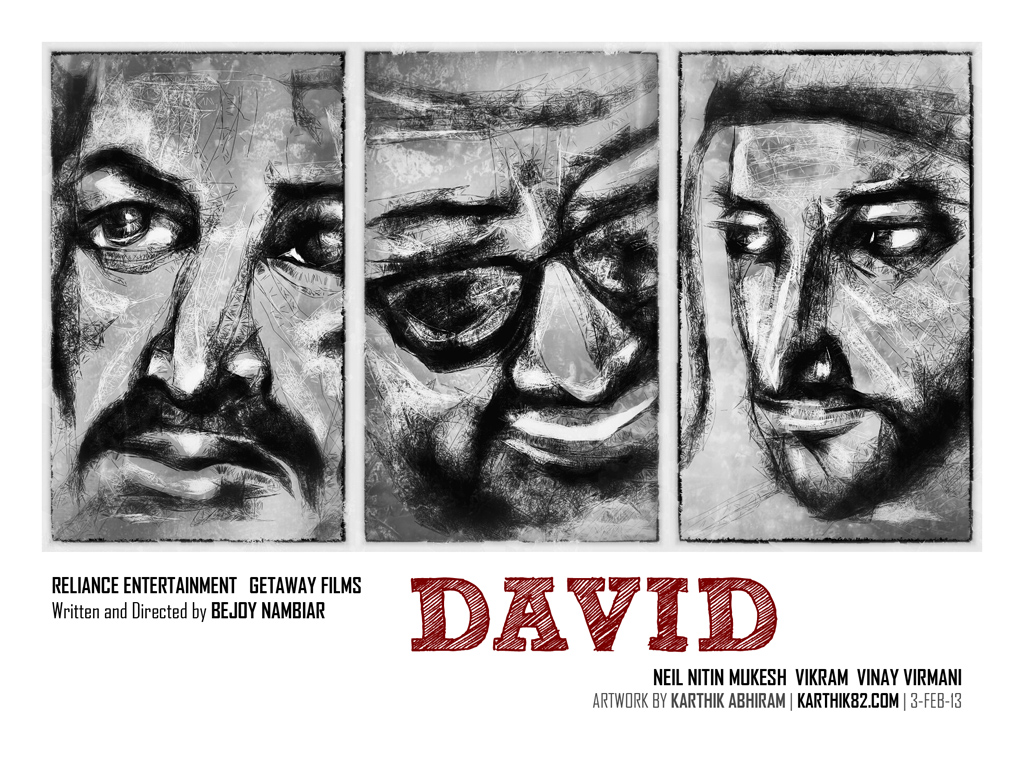
 The ABCs of Death
The ABCs of Death is an interesting project – this is an anthology horror movie consisting of 26 segments (each around 4 minutes long), one per letter of the alphabet. Each segment is about an instrument of death starting with that respective letter of the alphabet (say, “K is for Knife”). 26 different directors worked on this movie! More details can be found on the Wikipedia Page or this page on JoBlo, where you can view the trailer. Warning: Contains Blood & Gore, not for kids!
The people behind this anthology project left one slot free, for which they invited submissions from filmmakers from all around the world. This was the slot for the letter “T” and there were more than 100 shorts that they received (you can view them at this site). Out of all these films, “T is for Toilet” by Lee Hardcastle was selected to be in the final film.
T is for Turbo a.k.a. Turbo Kid – The Film
One of the top 3 finalists among the submitted entries was “T is for Turbo” by team RKSS (Roadkill Superstar – consisting of members Francois Simard, Anouk Whissell, Yoann-Karl Whissell). I absolutely LOVED this short film, and in fact I felt that this would be the winning entry that’d make it into the final The ABCs of Death film.
Here, you can watch the short film (contains violence, blood & gore, not for kids!) –
I loved this film since it so very closely matched the look and feel of the 1970s/80s post-apocalyptic movie! Specifically, I think they were referencing the loads of cheap Italian-made knock offs that came out after bigger-budgeted movies like Mad Max. The costumes, the make-up/gore effects, the cheesy dialogues, all make for a wonderfully nostalgic experience.
The filmmakers have come up with interesting characters also (the villain Zeus, Shandella, Beardman, the Skeleton mask guy, etc). The Turbo Kid himself reminds me of an older version of Commander Keen.
I liked the cinematography in the film (by Jean-Philippe Bernier). The film was shot on a Canon 5D Mark II DSLR, but using an anamorphic adapter. The camera shoots video in 1920 x 1080 resolution, which results in an aspect ratio of 16:9 or 1.78:1. However, a lot of productions use a wider aspect ratio like 2.35:1, which gives a more cinematic look (since that is the ratio many films are presented in theatrically). One way to achieve this would be to film in 16:9 and then crop off bits from the top and bottom. This means that we’re not effectively using all the information that the camera has captured (the resulting image dimensions might be 1920 x 800). An anamorphic adapter optically distorts the image horizontally, so it squishes a wider image into the 16:9 frame. Later on, the image can be un-squished in post-production, so what this achieves is an image width of roughly 2500 pixels and a height of 1080.
I believe this is the source of the slight blur/distortions at the edges of the frames, which for some reason I find aesthetically very good looking, and it goes even further to enhance the feel of an old movie.
The submissions for The ABCs of Death were supposed to be kept to 4 minutes in length. The longer (by few minutes) ‘director’s cut’ version of this film is called Turbo Kid. I don’t think that version is online anywhere – I suppose you have to attend a film festival where it is screened, to be able to see it.
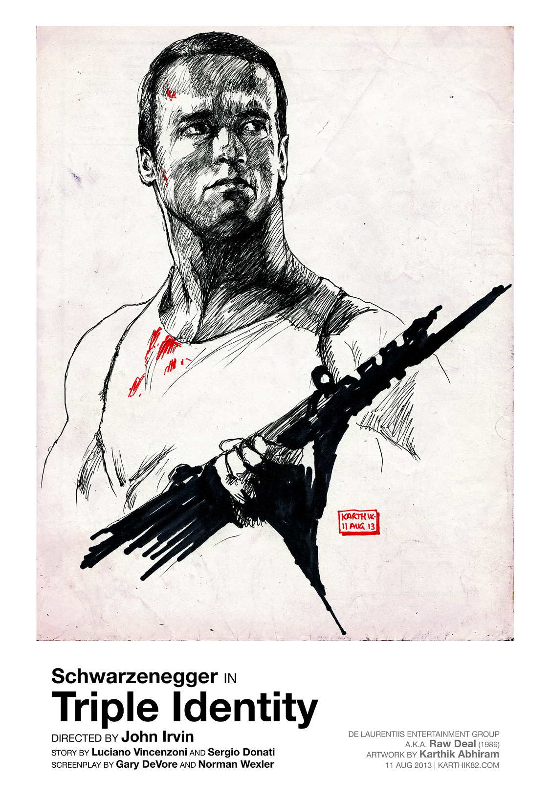
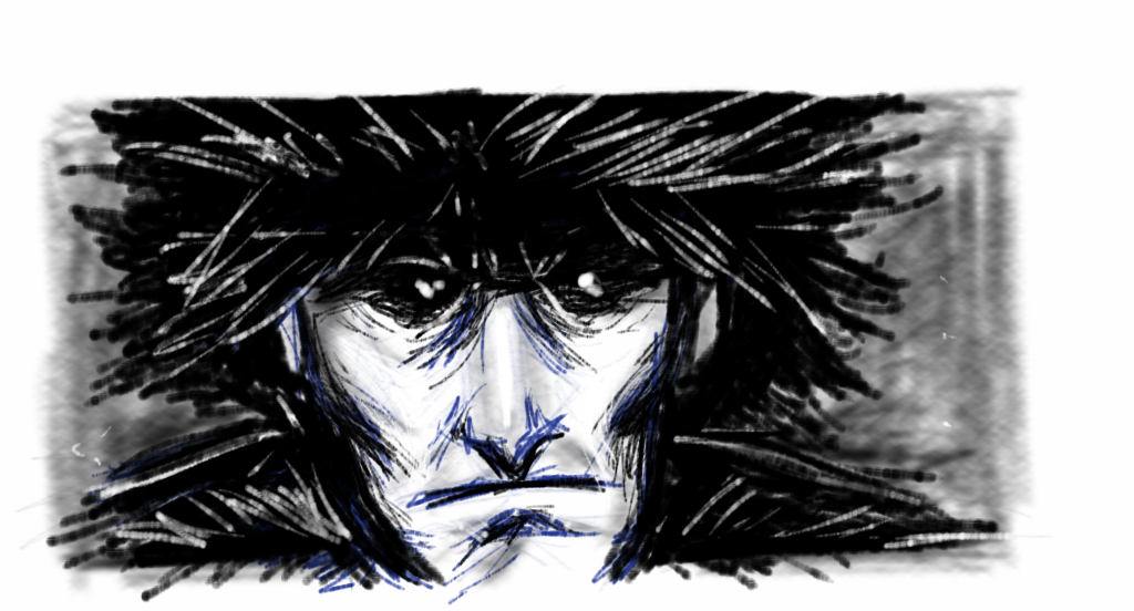
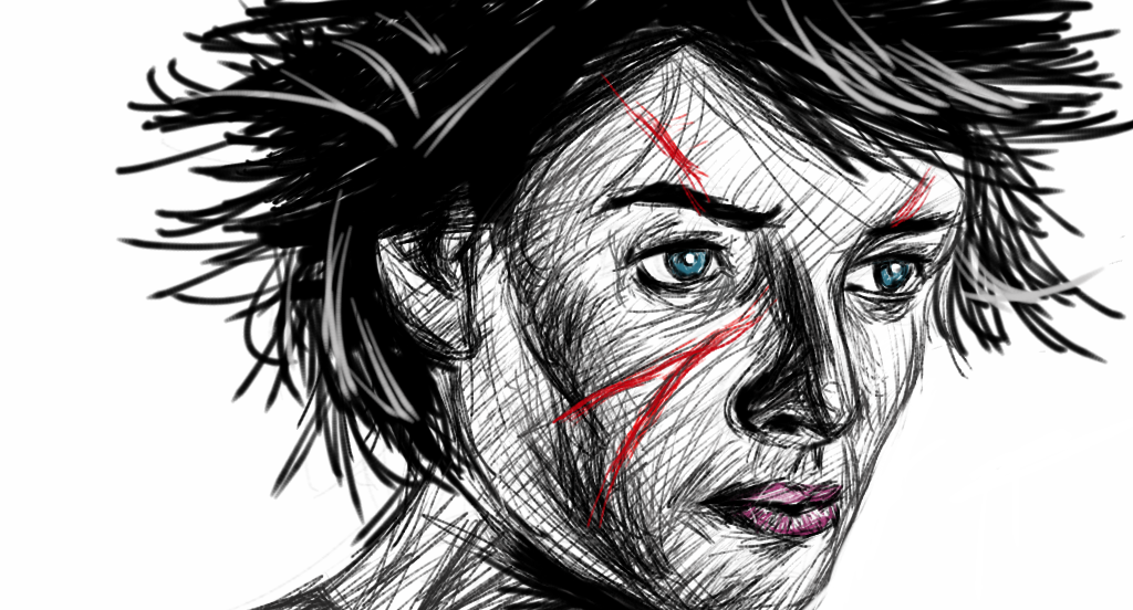
T is for Turbo – My Drawing
As is the case with things that I am deeply inspired by, I made a drawing based on this film. I did this based on screenshots grabbed from the actual film, and the shot of the Turbo Kid was referenced from a behind-the-scenes still.
 The drawing was done with pencil on an A5 size paper. I scanned it and added the paper texture in the background and the subtle colours in Photoshop. The fonts used are Helvetica for the credits, and the title of the film is in a font called Headline HPLHS (this font is designed to mimic the look of old woodcut headlines – I got it from the HP Lovecraft Historical Society site). Perhaps not the most appropriate for a retro-futuristic film like this, but I think it looks good. Cthulhu fhtagn!
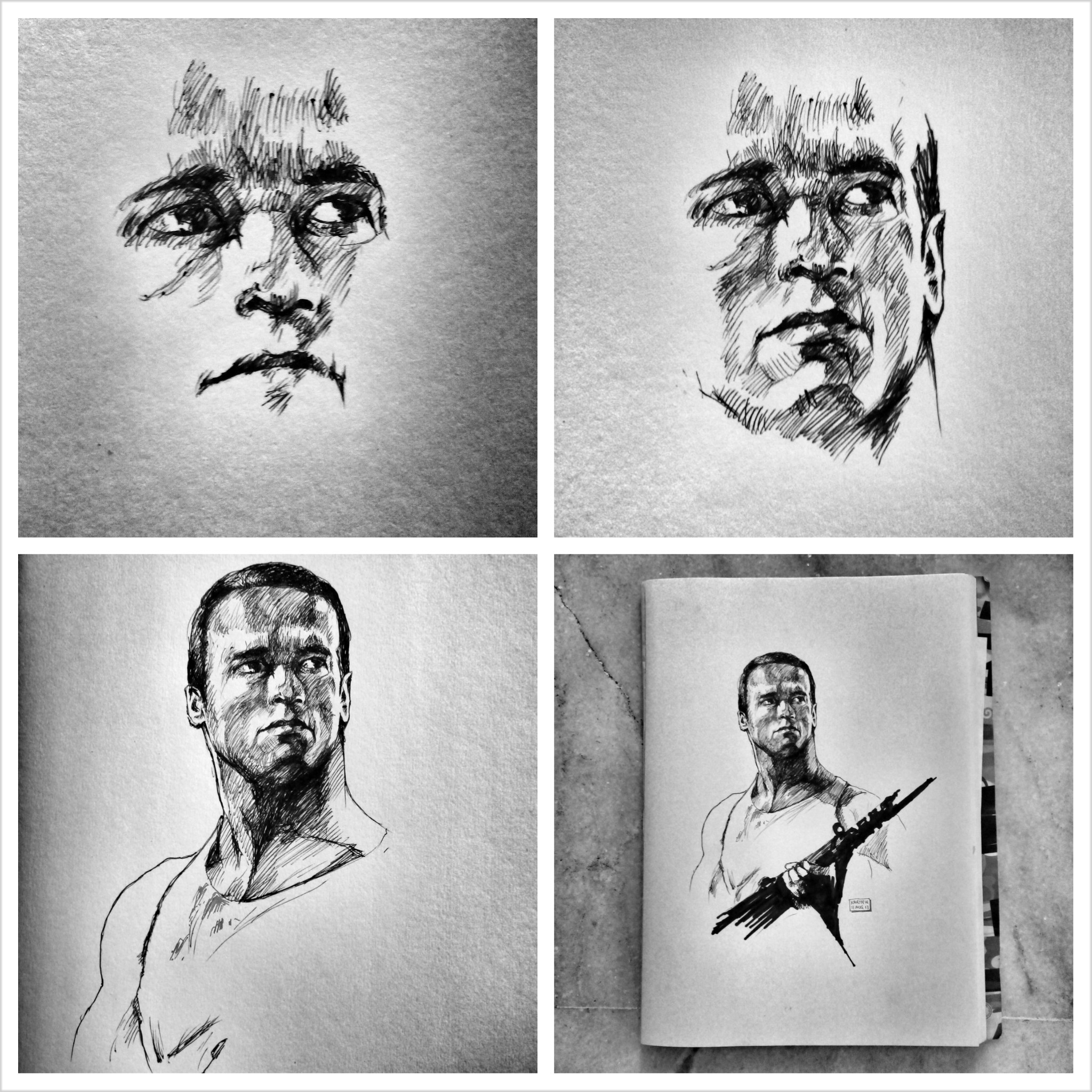
Want to see a few in-progress / behind-the-scenes photos as I was making this poster? Here is an album on Facebook which you can check out: T is for Turbo Drawing – Behind the Scenes [9 photos].
By the way, I posted this drawing on the RKSS Facebook page and even sent a message to them. They liked it – and that made me really happy.
The Music – “58 minutes pour vivre” by Le Matos
Apart from everything else I loved about T is for Turbo, a standout aspect for me was the music in it. It’s simply brilliant – the synthesizer-type music is exactly what you might find in a 1980s movie.
The track is called “58 minutes pour vivre” (translates to “58 minutes to live”) by the band Le Matos. A little bit of trivia – “58 Minutes” by Walter Wager is the novel that Die Hard 2 was adapted from.
Here is a music video for the track, also edited by RKSS. This video is called “58 Minutes dans le wasteland” which is very apt, as it is entirely edited together using footage from the very films that inspired Turbo Kid.
A full list of films featured in the video is there in the video description (if you view it on the Vimeo page). Should be a nice list to pick movies from and watch. And during the song, there is a bit of dialogue that comes up – that’s the voice of Bruce Willis and that’s a sample of dialogue from 12 Monkeys.
If you want to purchase the track, you can do so here (I did – I legally bought “58 minutes pour vivre”).
On a related note – you can also watch the grindhouse-inspired pulp horror fake trailer Demonitron: The Sixth Dimension by RKSS (it’s very good, and the look is again spot-on, though in some bits where they intentionally tried to emulate “unintentionally funny” – especially the ‘demon cake’ bit – I felt they went a little overboard, which kind of detracted from the experience). The music used in that trailer is called “Sarah” also by Le Matos. you can listen to the track and buy it here.
Other Notes
If you are on Facebook, you can view the “Making of T is for Turbo” album here (photos shot by Marie Raymond). In that album, this photo is the one I used as the reference for the Turbo Kid in my drawing. I think you have to “Like” the RKSS page to be able to see these photos.
There is an album with posters of their short movies. In that one, you can see the digitally-created official poster for the film. I love the look of the poster – I can almost imagine seeing this artwork on a VHS videotape and renting it immediately (back in the days when we used to rent videotapes). I love the caption – “This is the future, this is the year 1997”. Since Turbo Kid is inspired by those science fiction films made in the 70s and 80s, it makes sense that 1997 would be ‘the future’. (For that matter, even John Carpenter’s classic Escape from New York, released in 1981, was set in ‘the future’ of 1997.)
The latest update about Turbo Kid is that it is going to be adapted into a full-length feature film! This article has info about that. Count me in as a fan! I’m sure it’ll be a unique, quirky film that I will love. I look forward to seeing it, reviewing it and drawing something based on it, in the future… in the year 1997. “So what the fuck is your super power?”
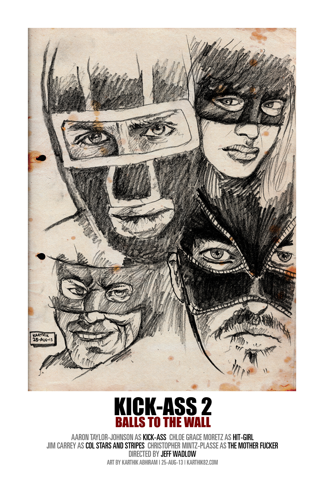 I drew this one in pencil, then scanned it in, added the paper texture in the background and the text.
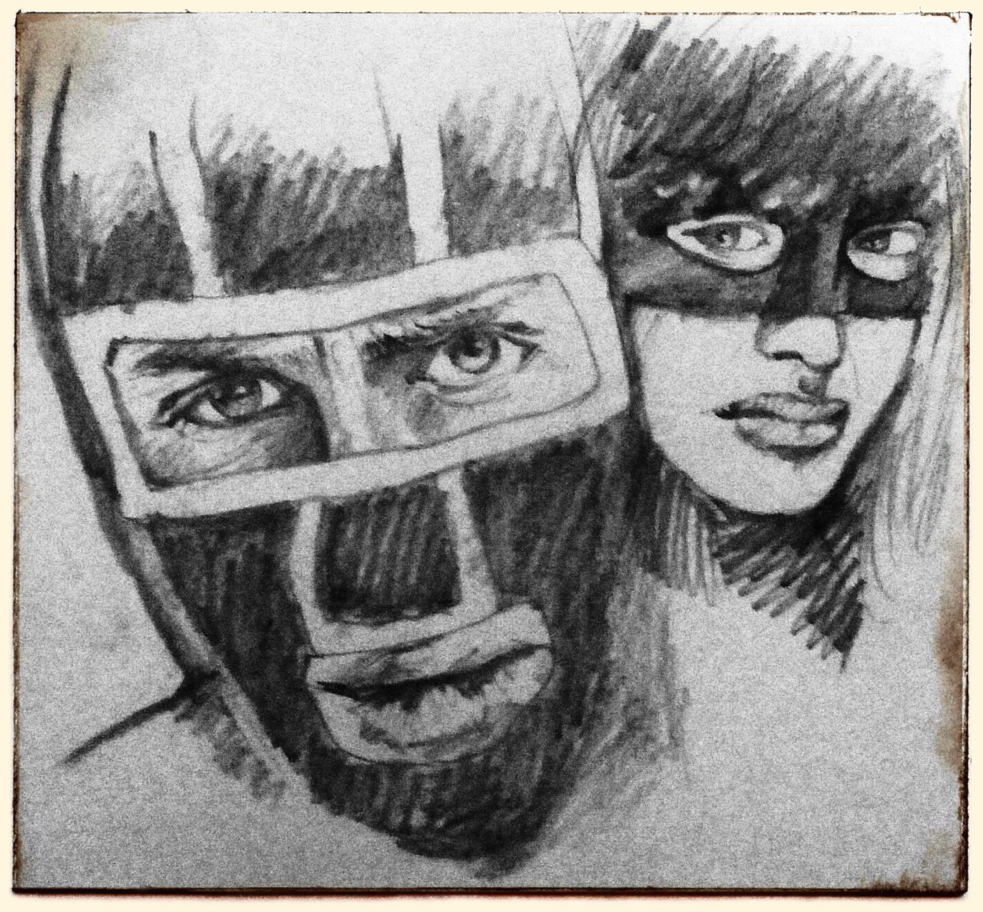 Above is an in-progress version of the drawing. The completed poster of mine has the working title for the movie, Kick-Ass 2: Balls to the Wall (I wonder why they changed it).