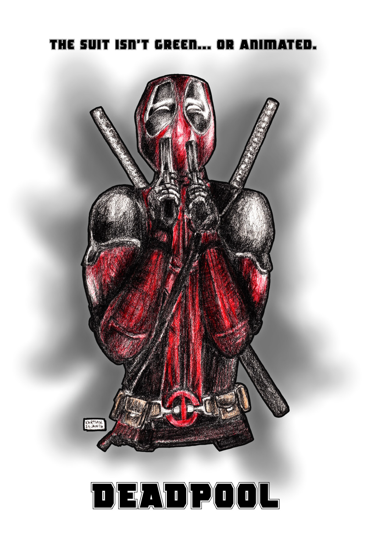
Everything about the upcoming Marvel Comics’ superhero movie Deadpool looks brilliant. I have not read any of the comics, but when the first trailer was released a few months ago, the movie seemed interesting. After that, there have been a number of posters and trailers that have come out, and all of them were very creative and well done. I was really inspired by these and so did a drawing, and also made that into a poster, which you can see below.
 Deadpool stars Ryan Reynolds as Wade Wilson, a former soldier who is diagnosed with terminal cancer, but is put through an experimental treatment that leaves him with incredible regenerative powers (but also makes him completely disfigured so he has to wear a mask and a suit). From the trailer, it looks like the people who put him through the experiment also kidnap the love of his life, and he has to go after them.
The character was featured in X-Men Origins: Wolverine (also played in that movie by Ryan Reynolds), though he was just some generic villain there.
This movie though, is proudly Rated R for strong violence and language throughout, sexual content and graphic nudity, and the studio issued multiple Red Band Trailers with violence and offensive jokes.
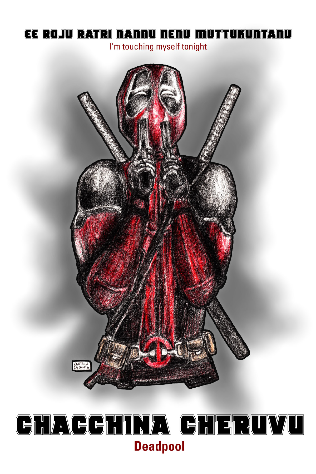
The first trailer that came out for this movie ended with Deadpool sniffing the smoke coming from his guns, and then saying “Oh, I’m touching myself tonight”, and this drawing depicts that scene (in the trailer though, you only see an extreme close-up of his face). How I came to choose this scene to draw is this – you see, interestingly, the studio seems to be investing quite a bit to promote this movie in India (though Deadpool is not a known character here), and are releasing dubbed versions of the movie in Hindi, Tamil and Telugu apart from the English version. A friend literally translated that line into Telugu and in a later WhatsApp conversation, suggested that the title would also be translated, and he came up with “Chacchina Cheruvu” (a pool or a lake that is dead). I thought I would make a poster out of it.
Here is the Telugu parody poster. This is all done in fun, no offense meant.
 In the English version of my poster, the line I used is also from the first trailer, in which Wade Wilson tells the people putting him through the experiment, not to make the super-suit green, or animated. This is a reference to the DC Comics movie Green Lantern, which also starred Ryan Reynolds as the titular superhero, and in that movie, his suit was green and animated. I did not like that movie at all, and apparently neither did too many other people, so a joke on that ended up in Deadpool.
The drawing was done on an A4 size drawing pad, with a 6B pencil, and a red colour pencil. For the belt I used an orange pencil. The drawing was scanned once done, and I added the background and the text in Photoshop. Here are the stages of the drawing –
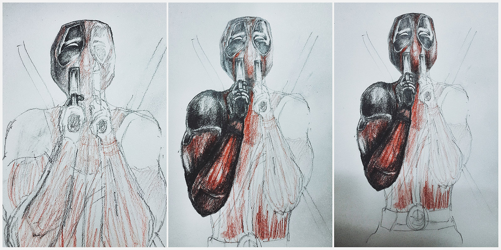 And this is the rough sketch of the poster concept. There were initially supposed to be blood splats behind Deadpool, but when I tried that it didn’t look good. Since Deadpool’s suit is also red, the red colour of the blood was distracting.
The tagline and the title of the movie in Telugu, I had decided, would be in the Deadpool font but would have an English translation below it, sort of like a movie subtitle.
 The below Instagram post shows you the finished drawing and the pencils used to make it.
Here is a short behind the scenes video that I also posted on Instagram, early on in the process of drawing.
Here below, are links to all the trailers that inspired this drawing. All of them are YouTube links which will open in a new window / tab.
- Red Band Trailer 1 – Released a few months ago, this is the one that has the “I’m touching myself tonight” bit.
- Red Band Trailer 2 – This is the second trailer for the movie released on Christmas Day, and is a pretty awesome trailer, the one that made me even more interested in the movie.
- Green Band Trailer 2 – The “safe for work” version of the previous trailer, with no swearing and violence. All the Indian language trailers are dubbed versions of this trailer.
- Hindi Trailer – The first Indian language trailer, based on the Green Band Trailer linked above. Probably, the one with the most swearing in it. Buzzfeed India featured an article about this trailer, which has captioned screenshots from it. You can see the article here.
- Tamil Trailer – Second Indian trailer, nothing much offensive about it.
- Telugu Trailer – Third Indian trailer, again, not offensive at all.
These are the three songs used in the trailers (again, YouTube links).
- Shoop by Salt n’ Pepa
- Karma by Jamie N Commons
- X Gon’ Give it to Ya by DMX
The font used in the poster is called Rogue Hero.
A version of this artwork is available for you to purchase as a print (sans text), on my Postergully store. You can purchase it as a poster, or as a T-Shirt.
- Wall Artwork (Poster, Laminated Framed, Glass Framed)
- Men’s T-Shirt
- Women’s T-Shirt
Deadpool will be out in theatres on 12-Feb-16 in India. I’ll see it in as many languages as I can theatrically, and then watch an uncut version later (since sadly, I know that our censors would make cuts to the movie inspite of giving it an adults only certificate).