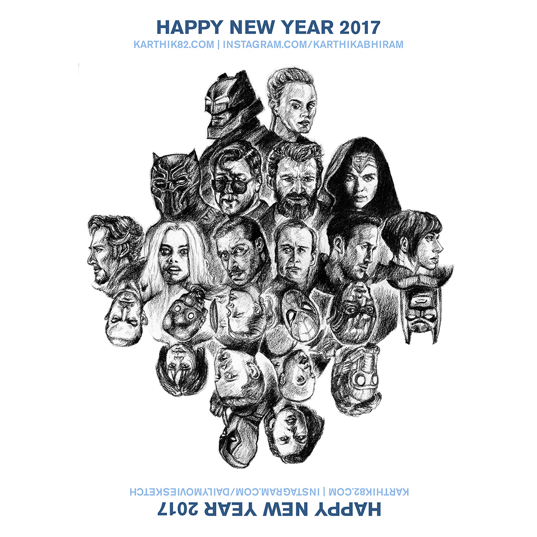
For this year’s New Year Greeting, I thought I would make an artwork and a post, with my selections of the Best Movies of 2016, and the movies I was looking forward to watching in 2017. The artwork is below – showing 24 movies in total. This artwork was posted on my Instagram account @karthikabhiram.
In April 2016, I started a second Instagram account for movie related sketches – @dailymoviesketch, and an associated Facebook page, Daily Movie Sketch. I actually did more than 120 drawings on consecutive days without a miss, there – as of today, there are 210 sketches on that page. This artwork was posted on that account as well. As this artwork can be viewed even if you invert it, the inverted version was posted there. Please do follow me on my Instagram accounts, since, I’m very regular in posting on both of them. I post one picture a day, on each of those accounts and blogging-wise, everything happens there. Movie reviews are posted on my sketch account.
You could say, this was the last drawing of 2016 and the first drawing of 2017, as I started it on 31st December and completed it on 1st January. It was done with one 0.5mm mechanical pencil on A4 paper. It took me many hours to do as it essentially involved doing 24 sketches.
One side of the drawing has the best movies of 2016, and the other has the awaited movies of 2017.
Here is the inverted version of the drawing –
What are the movies represented here? My best of 2016 list is divided into three categories, the best of the best, the very good, and the notable movies. This year, the list includes TV shows as well.
Overall Best
Batman v Superman: Dawn of Justice
Captain America: Civil War
The Nice Guys
Sultan
Suicide Squad
Doctor Strange
Arrival
Rogue One
Dangal
Stranger Things S1
Deadpool
The Jungle Book 3D
Black Mirror S3
Very Good
Nannaku Prematho
Neerja
24
The Conjuring 2
Pellichoopulu
Dhruva
Ash vs Evil Dead S2
Udta Punjab
Notable
Kshanam
10 Cloverfield Lane
Don’t Breathe
Janatha Garage
U-Turn
Movies Awaited in 2017
Resident Evil: The Final Chapter
XXX: Return of Xander Cage
The Fate of the Furious
Logan
Guardians of the Galaxy Vol 2
Alien: Covenant
Wonder Woman
Spider-Man: Homecoming
Blade Runner 2049
Justice League
Bahubali 2
The Lego Batman Movie
Split
John Wick Chapter 2
The Belko Experiment
Ghost in the Shell
War for the Planet of the Apes
Dunkirk
Baby Driver
Insidious Chapter 4
Saw: Legacy
God Particle
Thor: Ragnarok
Star Wars: Episode VIII
What were your favourite movies of 2016 and what movies are you looking forward to in 2017?
I also recently created an account on Paintcollar, where you can purchase prints of artwork. I have made this artwork available as a T-Shirt design. You can purchase both orientations. The text in the artwork for the T-Shirt design varies. Here are the two designs.
This is the first version –
And this is the “upside-down” version –
The links where you can view these two artworks are below –
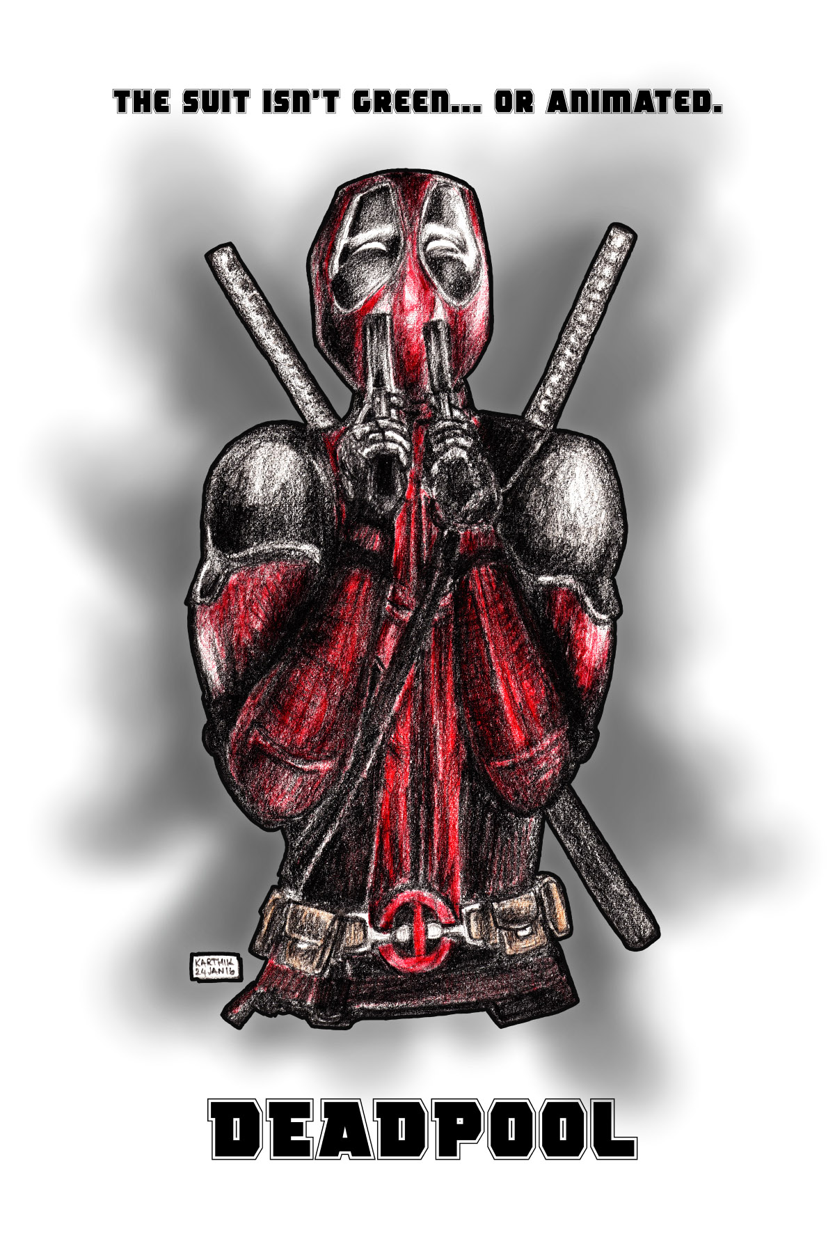
Everything about the upcoming Marvel Comics’ superhero movie Deadpool looks brilliant. I have not read any of the comics, but when the first trailer was released a few months ago, the movie seemed interesting. After that, there have been a number of posters and trailers that have come out, and all of them were very creative and well done. I was really inspired by these and so did a drawing, and also made that into a poster, which you can see below.
Deadpool stars Ryan Reynolds as Wade Wilson, a former soldier who is diagnosed with terminal cancer, but is put through an experimental treatment that leaves him with incredible regenerative powers (but also makes him completely disfigured so he has to wear a mask and a suit). From the trailer, it looks like the people who put him through the experiment also kidnap the love of his life, and he has to go after them.
The character was featured in X-Men Origins: Wolverine (also played in that movie by Ryan Reynolds), though he was just some generic villain there.
This movie though, is proudly Rated R for strong violence and language throughout, sexual content and graphic nudity, and the studio issued multiple Red Band Trailers with violence and offensive jokes.
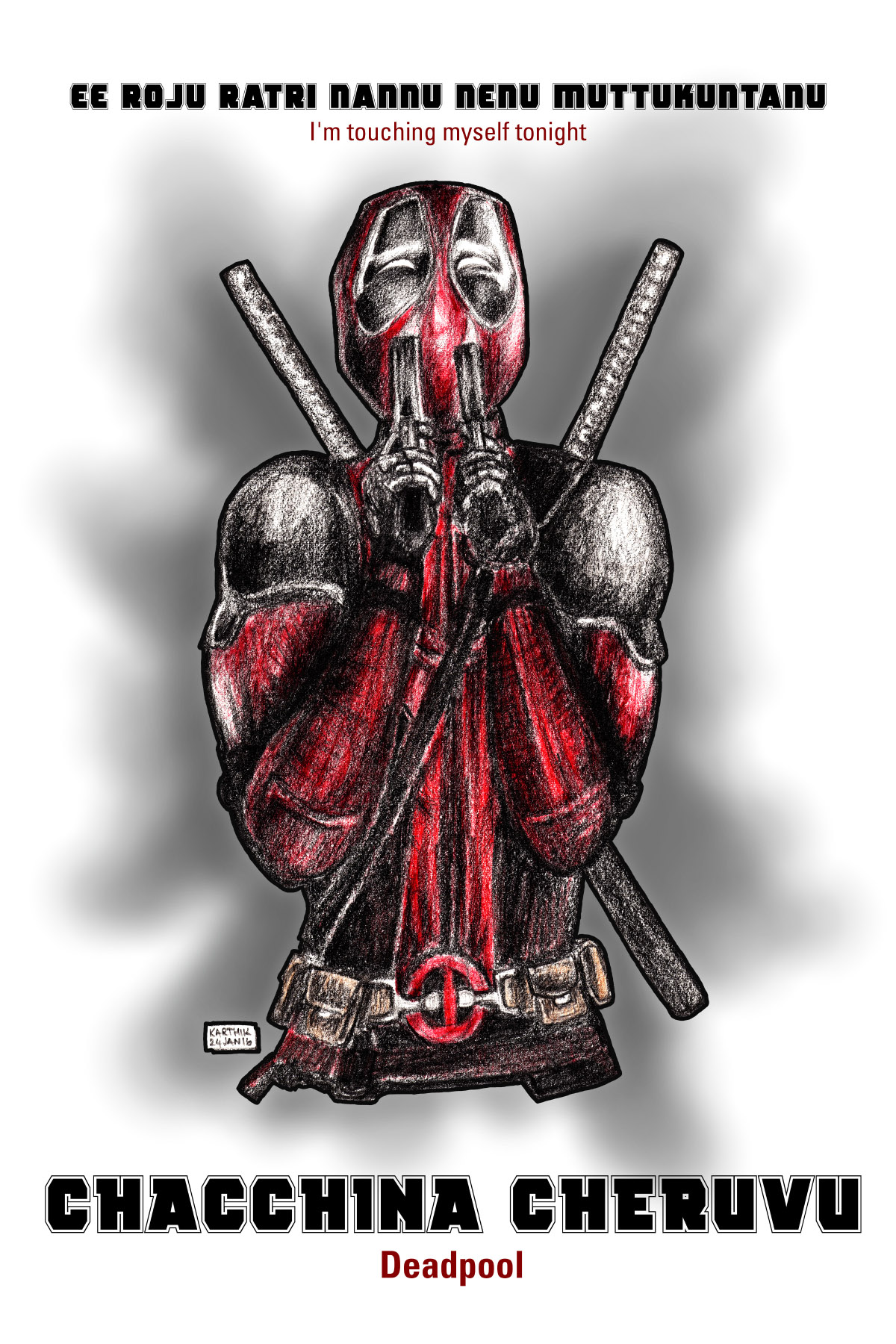
The first trailer that came out for this movie ended with Deadpool sniffing the smoke coming from his guns, and then saying “Oh, I’m touching myself tonight”, and this drawing depicts that scene (in the trailer though, you only see an extreme close-up of his face). How I came to choose this scene to draw is this – you see, interestingly, the studio seems to be investing quite a bit to promote this movie in India (though Deadpool is not a known character here), and are releasing dubbed versions of the movie in Hindi, Tamil and Telugu apart from the English version. A friend literally translated that line into Telugu and in a later WhatsApp conversation, suggested that the title would also be translated, and he came up with “Chacchina Cheruvu” (a pool or a lake that is dead). I thought I would make a poster out of it.
Here is the Telugu parody poster. This is all done in fun, no offense meant.
In the English version of my poster, the line I used is also from the first trailer, in which Wade Wilson tells the people putting him through the experiment, not to make the super-suit green, or animated. This is a reference to the DC Comics movie Green Lantern, which also starred Ryan Reynolds as the titular superhero, and in that movie, his suit was green and animated. I did not like that movie at all, and apparently neither did too many other people, so a joke on that ended up in Deadpool.
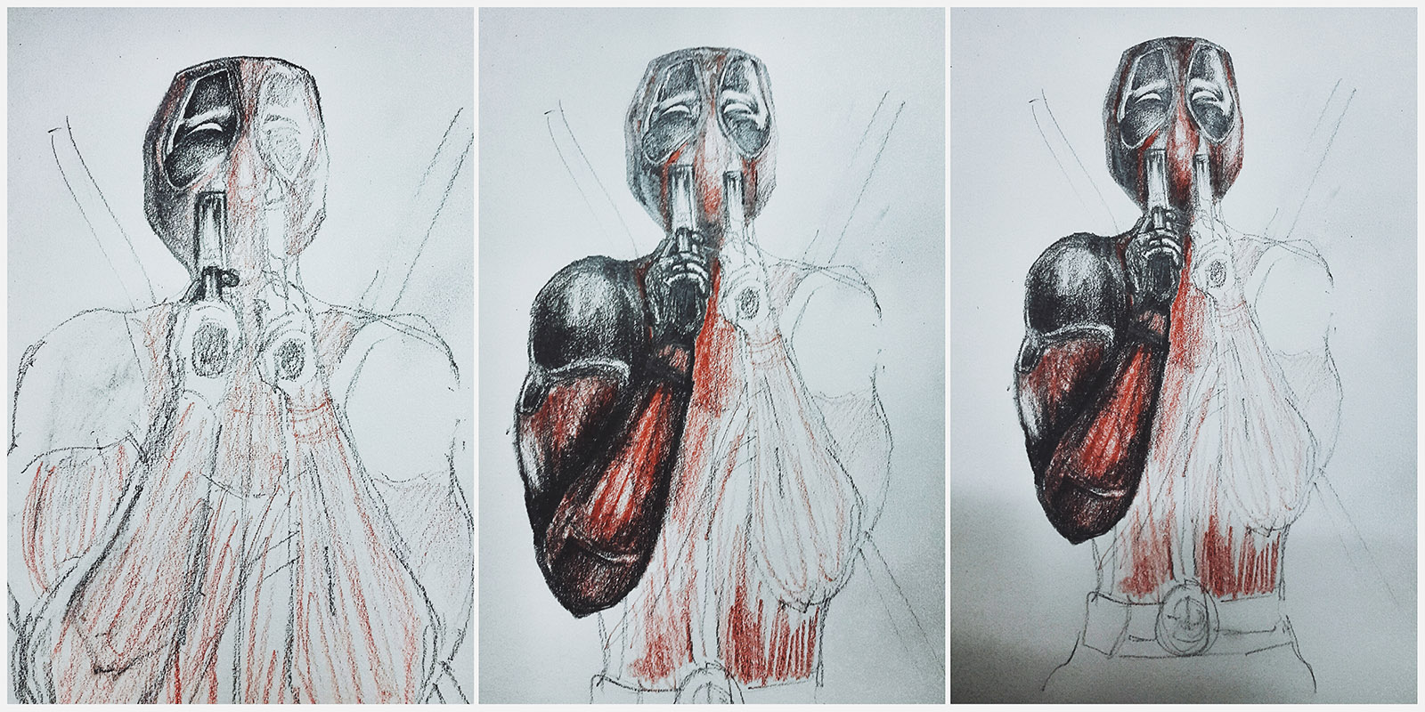
The drawing was done on an A4 size drawing pad, with a 6B pencil, and a red colour pencil. For the belt I used an orange pencil. The drawing was scanned once done, and I added the background and the text in Photoshop. Here are the stages of the drawing –
And this is the rough sketch of the poster concept. There were initially supposed to be blood splats behind Deadpool, but when I tried that it didn’t look good. Since Deadpool’s suit is also red, the red colour of the blood was distracting.
The tagline and the title of the movie in Telugu, I had decided, would be in the Deadpool font but would have an English translation below it, sort of like a movie subtitle.
The below Instagram post shows you the finished drawing and the pencils used to make it.
Here below, are links to all the trailers that inspired this drawing. All of them are YouTube links which will open in a new window / tab.
Red Band Trailer 1 – Released a few months ago, this is the one that has the “I’m touching myself tonight” bit.
Red Band Trailer 2 – This is the second trailer for the movie released on Christmas Day, and is a pretty awesome trailer, the one that made me even more interested in the movie.
Green Band Trailer 2 – The “safe for work” version of the previous trailer, with no swearing and violence. All the Indian language trailers are dubbed versions of this trailer.
Hindi Trailer – The first Indian language trailer, based on the Green Band Trailer linked above. Probably, the one with the most swearing in it. Buzzfeed India featured an article about this trailer, which has captioned screenshots from it. You can see the article here.
Tamil Trailer – Second Indian trailer, nothing much offensive about it.
Telugu Trailer – Third Indian trailer, again, not offensive at all.
These are the three songs used in the trailers (again, YouTube links).
A version of this artwork is available for you to purchase as a print (sans text), on my Postergully store. You can purchase it as a poster, or as a T-Shirt.
Deadpool will be out in theatres on 12-Feb-16 in India. I’ll see it in as many languages as I can theatrically, and then watch an uncut version later (since sadly, I know that our censors would make cuts to the movie inspite of giving it an adults only certificate).
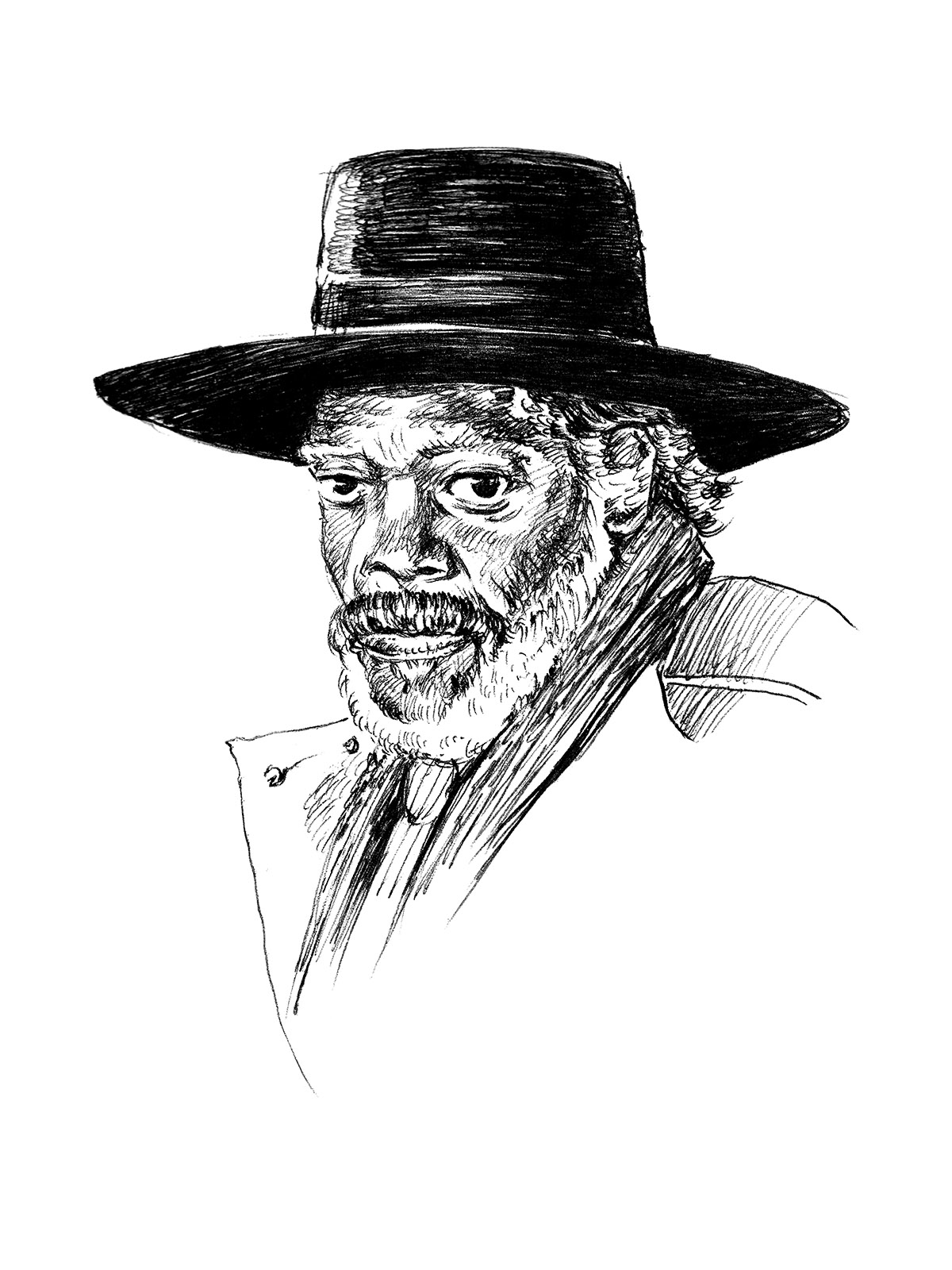
The Hateful Eight is Quentin Tarantino’s Eighth Film (well, it is if you consider Kill Bill as one movie). Being a huge Tarantino fan (his Pulp Fiction is one of my all time favourite movies), I was eagerly awaiting the release of this movie, and I finally got to see it a few days ago. As expected, I loved the movie, and did this drawing of Samuel L Jackson as Major Marquis Warren from it –
The movie is set a few years after the American Civil War. It opens showing us a stagecoach with two passengers – bounty hunter John Ruth “The Hangman” (Kurt Russell) and his prisoner, Daisy Domergue (Jennifer Jason Leigh), heading towards the town of Red Rock, trying to escape a blizzard. They are soon about to have company – stranded in the snow are Major Marquis Warren (Samuel L Jackson) and Chris Mannix (Walton Goggins), and the two are picked up by the stagecoach. In order to escape the blizzard, the party must stop midway at a place called Minnie’s Haberdashery, where they must stay for the next few days. Already at Minnie’s are a few other characters – Red Rock’s Hangman, Oswaldo Mobray (Tim Roth), Joe Gage (Michael Madsen), Bob the Mexican (Demian Bichir) and General Sanford Smithers (Bruce Dern).
Pretty soon, suspicions arise, and John says that one or more of the people at Minnie’s are not who they say they are, and they may have their own agenda involving the bounty on his prisoner.
What follows is an engaging mystery-thriller-Western hybrid that keeps one completely absorbed for three hours. The characters in all of Quentin Tarantino’s movies seem to be crafted with a lot of love, and it is no different here, and the actors really bring them to life with their excellent performances (Leigh and Jackson are standouts). The dialogues and screenplay are great, as is typical of a Tarantino movie. The first half of the movie might be considered to be a little slower moving, but it builds the characters so it’s necessary. The movie picks up pace in the second half.
The movie features beautiful cinematography (by Robert Richardson, who has shot all of Tarantino’s movies after Kill Bill, except for Death Proof). It was shot in a process called Ultra Panavision 70, where the image is shot on 70mm film but using anamorphic lenses to create a very wide image (2.76:1 aspect ratio as opposed to the typical 2.35:1 widescreen image if movies are shot on 35mm film or digital). This is apparently only the 11th film to be shot in that process, and there exists a “Roadshow” version of the movie which was projected on film as well, in selected theatres in the US. The sweeping and snowy landscape scenes look great, but one might question what difference would filming in 70mm make, to indoor scenes. It affords the opportunity to create some interesting compositions, as there are several shots where the entire frame is used to show different characters in the foreground as well as background. There were a couple of instances where I noticed the use of a split-focus diopter to get different planes in focus in the same shot.
Unlike several of Tarantino’s movies, which used previously existing music, this one features original music written for it, by Ennio Morricone (the composer for Sergio Leone’s westerns such as The Good, The Bad and The Ugly). I thought the music was very good and liked the opening theme in particular.
One of the inspirations for The Hateful Eight was the 1982 John Carpenter horror movie The Thing. That movie also stars Kurt Russell, it is set in an isolated place in extreme cold, it has characters who are not what they seem to be and a sense of paranoia among the other characters. That movie was also scored by Ennio Morricone (interestingly, John Carpenter got Morricone to score the movie and made him do a very John Carpenter-ish music score), and in fact, The Hateful Eight uses a couple of tracks from The Thing on its soundtrack, and some of the other music is unreleased music originally composed for the 1982 film.
I loved the movie overall. I felt Django Unchained was a little more enjoyable and more upbeat compared to this movie (the two are set in the same Universe). Overall, I would rate it a solid 9/10.
Warning: If you are watching this movie in a theatre in India, beware that it is cut. Swear words are muted, but not completely consistently (for example, the occasional “fuck” is audible, while most instances of “bitch” are muted). It’s distracting. They have also cut the bloodier scenes, so you would be puzzled at the fate of at least two of the characters whose death is not shown. You would still be able to enjoy the movie (the cuts total to around 2 minutes), but it’s not the way the movie was intended to be seen. Unfortunately, if you want to enjoy the theatrical experience, you’ll have to tolerate these alterations. Of course, there are ways to see the missing scenes if one wants.
It’s sad that there need to be cuts in a movie that is already certified as “A”, suitable for adults only – something I have been against for several years. David Fincher’s The Girl with the Dragon Tattoo and Fede Alvarez’s Evil Dead didn’t even get a theatrical release in India, while Fincher’s Gone Girl had some weird pans and zooms to cover nudity. Our censor board is only promoting piracy by doing this!
The version of the movie that I saw (PVR Cinemas at Hyderabad Central Mall) seemed to be projected in 2.35:1 ratio. While I don’t think any part of the image was cropped, it seemed to be squished horizontally to fit the 2.76:1 frame into the 2.35:1 shape.
Extras
The below video talks about the different widescreen processes (and aspect ratios) that have been employed by filmmakers through the years –
And this video talks about the “Roadshow” version of The Hateful Eight, and also about how Panavision supported Tarantino in shooting this movie on glorious 70mm film –
The Opening Credits feature two fonts (apart from the title of the movie itself, which I think is hand made) – as far as I can make out, the names of the cast are typeset in Rockwell, and the rest of the credits are in Tarantino’s favourite ITC Benguiat.
The movie features Red Apple tobacco (which is a fictional brand used in many of Tarantino movies).
The Samuel L Jackson drawing which I did (in ballpoint pen on paper), is available to purchase here at my Postergully store. Postergully ships worldwide, and their prices are reasonable. The prints are of good quality too. Visit my store here, and if it is your first purchase at Postergully, you can use the code PGARTIST to get a 15% discount.
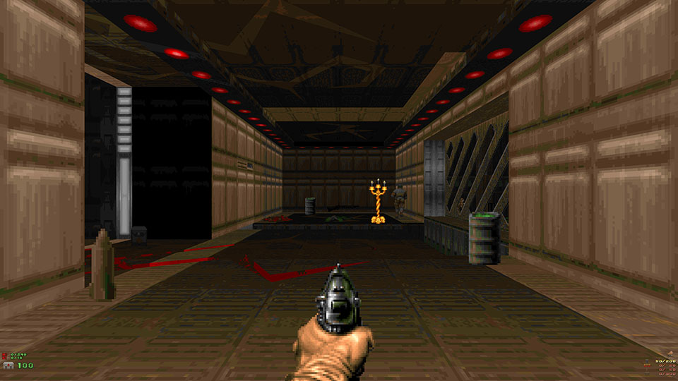
John Romero, one of the designers of the original Doom games released a new level yesterday. This is the first level he is releasing in around 21 years (before this, he designed two of the levels in the original Doom expansion, The Ultimate Doom, in 1995). This new level is his first non-commercial release, it replaces E1M8 of the original game, and I played through it yesterday. Here are my comments about it.
E1M8: “Phobos Anomaly”, the last level of Episode 1 “Knee-Deep in the Dead” of the original game was a significant one, since it featured the first “bosses” of Doom, two Barons of Hell (also called the “Bruiser Brothers”). The original level was considerably short, and after you got through the first seven levels (or eight, if you played the secret E1M9 level), you fought the bosses and then exited the level. [SPOILER: Once you killed the two barons, a teleporter is revealed and you pass through it to come to a dark room, where you are fired upon by many monsters and the level ends as a ‘cliffhanger’.] That level was created by Sandy Petersen (who designed much of Episodes 2 and 3).
You could say, this level (according to the text file, it’s called “Tech Gone Bad“) is a reboot or reimagining of the ending map. It is designed only using the original Doom Episode 1’s resources (so no graphics or items from later Episodes seen). It syncs up well with the original levels’ look and feel (that’s not so surprising, considering that John Romero himself was the one who created most of the original Episode 1 maps). However, for a level made in 2015/6, it obviously is more polished than the older levels.
The level flows really well, you start off in a tech base surrounded by radioactive ooze all around, and streaks of hot red lava indicate that hell is transforming the entire place slowly. There are a couple of neighbouring buildings which you would need to gradually gain access to. After the starting base area, there are primarily two major sections in the level – one after you get the yellow key card, and the one after you get the red key card. It’s probably not so much of a spoiler, but the ending of the level has you facing two Barons of Hell, and multiple other monsters. Once you kill the Barons, the exit teleporter is revealed and when you pass through it, the level ends in a similar way as the original E1M8.
I really enjoyed playing through the level and figuring out the route to the exit. You would have to work things out but I liked that there was no unnecessary key or switch hunting required. The difficulty level is quite high, probably comparable to that of Romero’s E4M6 from The Ultimate Doom. This is thanks to many shotgunners and you having to wade through pools of radioactive nukage. I played the level on Skill 1 and completed it, at Skill 4, there are close to 300 monsters on the map.
The visuals are very nice, the map looked really interesting had a good variation of heights. You would go to rooftops, and down tunnels with ooze, and there are ambushes that would remind you of certain aspects from the original Episode 1 levels. Lighting and colour were all really nice too. The map looked good without being overly detailed.
This level was built with Pascal vd Heiden’s Doom Builder 2. I am not sure why Romero decided to make a level for Doom all of a sudden, but it’s a really nice thing for all Doom fans. He mentioned in the text file that it’s a warm up. I wonder what for!
It has been a long time since I played and reviewed a Doom level. If you’ve been following me on Instagram (@karthikabhiram), then you know that on 31-Dec-15, I bought myself a new laptop after 5 years, a Dell XPS 13. This post is being written on that laptop, and I also played the level (with the ZDoom engine) on it.
If you want to download and play the level yourself, you can do so here (this is a Dropbox link that John Romero posted in his tweet, which I’ve embedded below). You will need a copy of the either the Doom shareware WAD (doom1.wad) or the full Doom / Ultimate Doom WAD (for that you would need to purchase the game).
I had also released a Doom Episode 1 tribute map back in 2002, called The Other Side of Phobos. At that time, it took me about a month to make, and I had a good time making it. I think it’s a fun little map to play. If you would like to play that, you can check it out here. The rest of my Doom levels are available here (I mainly did maps for Doom II).
Since Romero’s level runs on E1M8, you will be listening to the track “Sign of Evil” by Robert Prince. Over the years, Doom’s music has been remixed many times, but in my opinion, this moody atmospheric version called “Doomed” by Rimco (released 16 years ago) is one of the best versions of that track. You can listen to it on YouTube below, or download the MP3 from here.
I posted about John Romero’s level on Instagram, and that happened to be the 2000th post on my account there. I have embedded that as well, below.
That’s about it for this post, the first post of 2016 on this blog! I resolve to be more active this year (the whole of last year, I only made one post here).
If you have been following me on Facebook and Instagram, then you know that I recently attended the Hyderabad Artists Meetup Vol. 2 at Collab House, Jubilee Hills in the beginning of this month. At this event, Sri Priyatham gave a workshop on Caricature drawing. It has been years since I drew caricatures, but at this event I tried my hand at it. The subject we chose to do that day was Sherlock and The Imitation Game star Benedict Cumberbatch. Here is my caricature –
This was done with pencil in my sketchbook. Also inspired by Sri, I joined this Facebook Group called Caricaturama Showdown 3000! and decided to participate in their weekly Caricature Challenges. This week’s subject is Howard Stern. Here’s my caricature –
I’ll post more drawings as I do them. Would you be interested in purchasing prints of these?
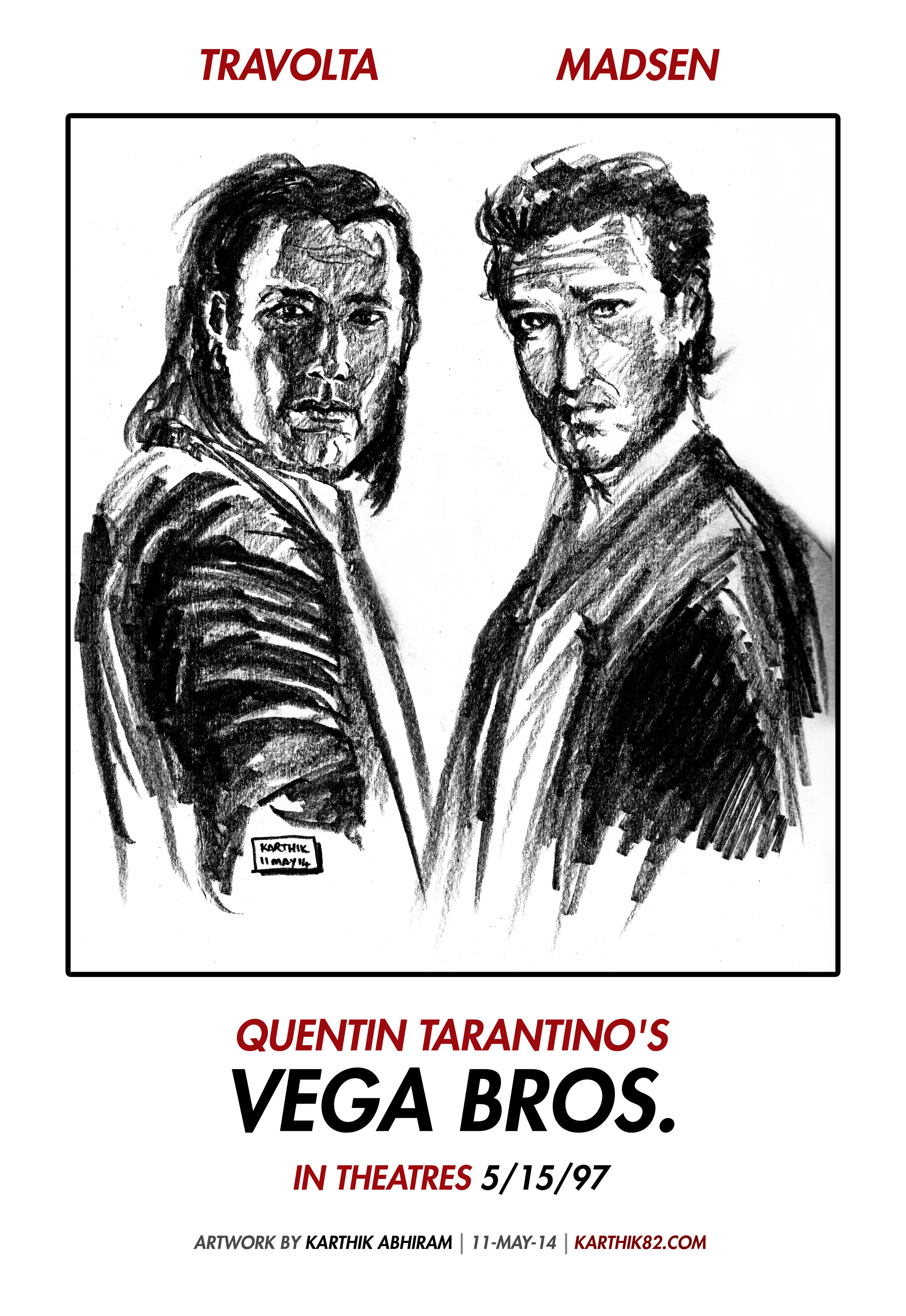
In an alternate universe, Quentin Tarantino would have written and directed a movie called Vega Bros. starring John Travolta as Vincent Vega (from Pulp Fiction) and Michael Madsen as Vic Vega (from Reservoir Dogs). Here is a teaser poster for that fictional movie –
This was a quick drawing done with a 6B pencil on paper, and then scanned and edited in Photoshop. The text is simple and is in Futura Heavy Oblique. The fictional release date is my birthday in 1997.
This is a drawing based on Paul Verhoeven’s 1987 movie RoboCop that I did this morning. I watched the remake yesterday and the original a couple of days before that. That’s what inspired this drawing.
I am very nostalgic about the original RoboCop. It was a movie I practically grew up with. This drawing was done with a 6B pencil on paper and the image above is a photo taken with my phone, processed with VSCOCam for Android and this post is being made from my phone only.
Here’s a RoboCop drawing that I did 19 years ago –
The remake was pretty good. The good thing about it was that it was very different from the original so you judge it on its own merits. But nostalgic feelings considered, the original wins out in my opinion!
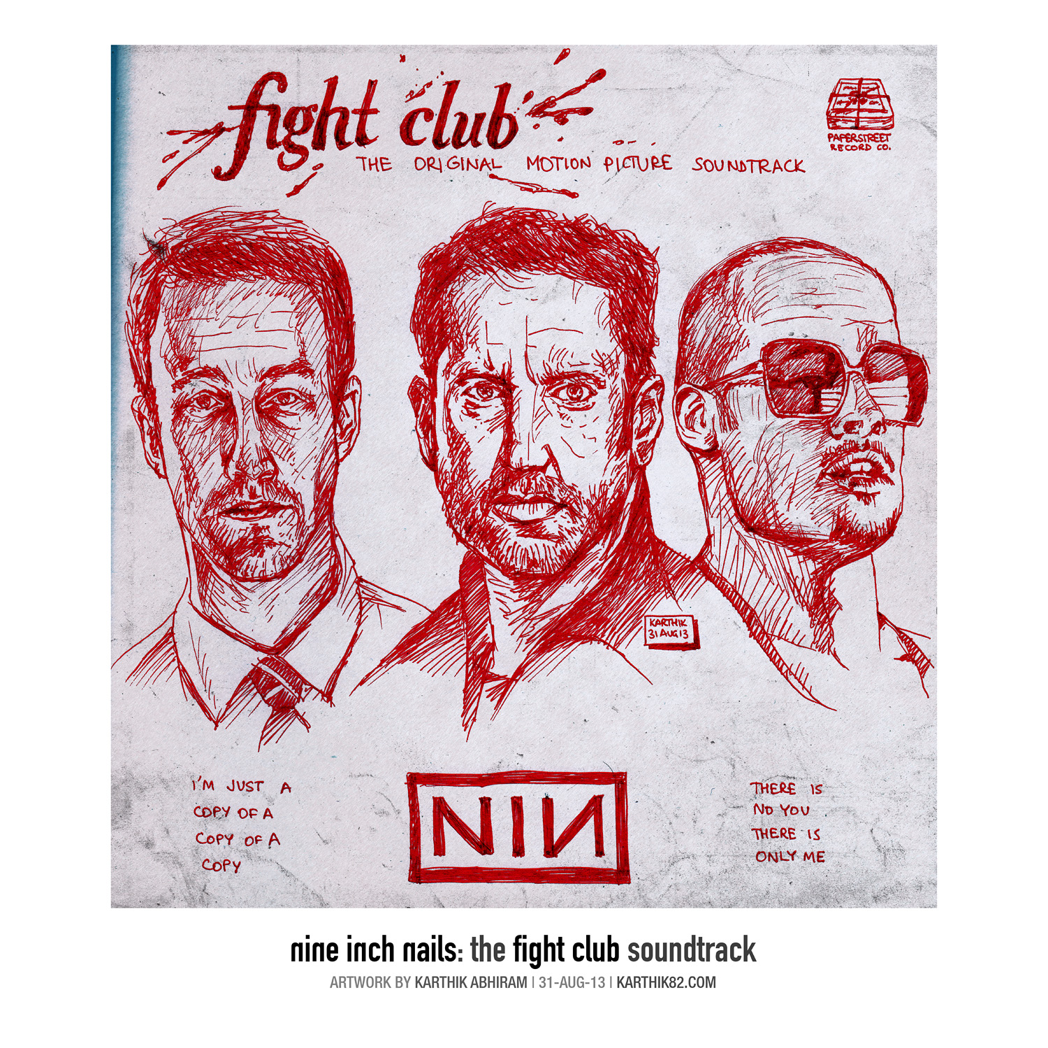
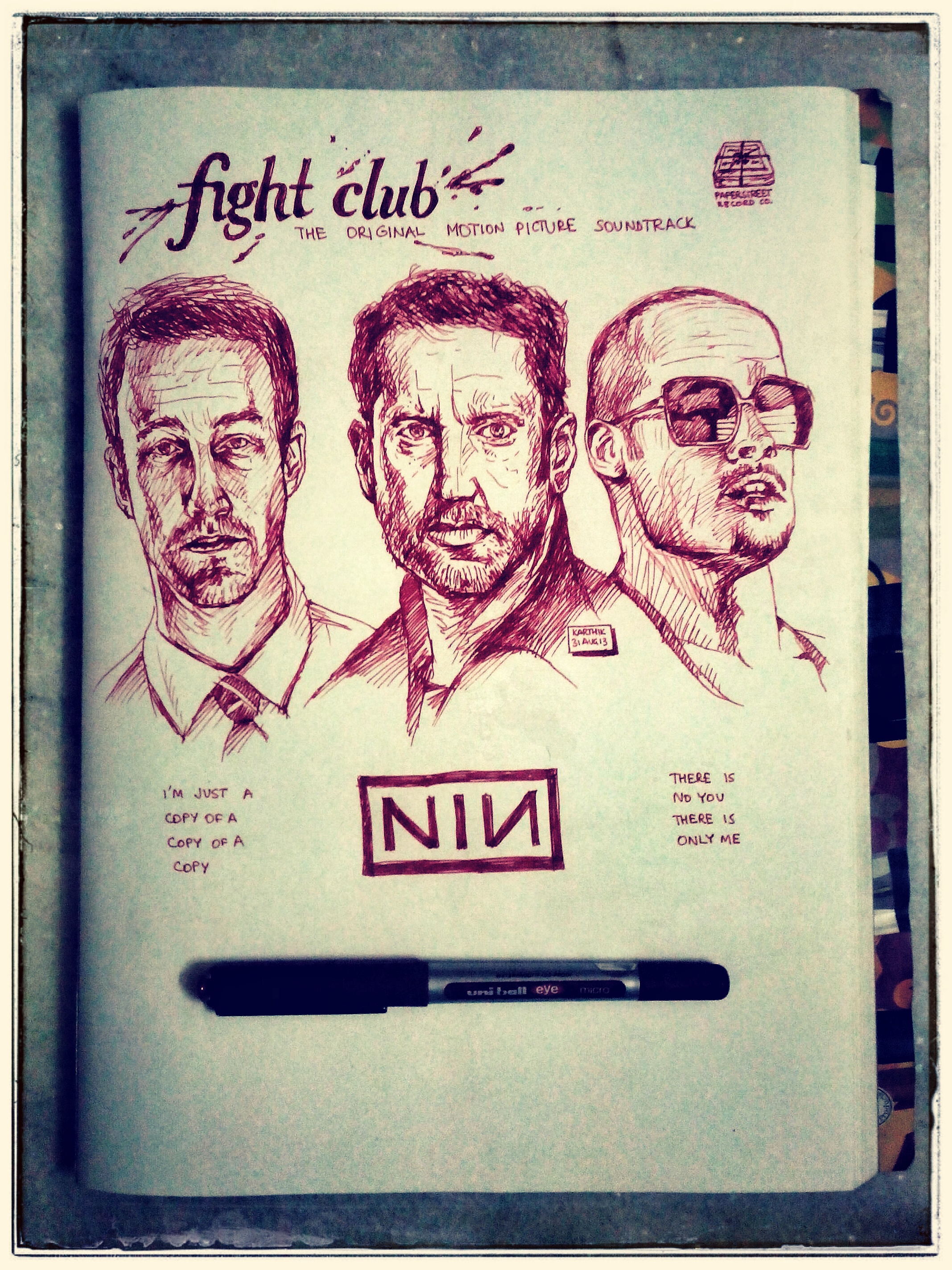
Think about it – there’s a line of dialogue in David Fincher’s Fight Club (one of my all-time favourite movies), where the Narrator (Edward Norton’s character) says, “With insomnia, nothing’s real. Everything is far away. Everything is a copy of a copy of a copy.” One of the songs from “Hesitation Marks”, the latest album from Nine Inch Nails, is called “Copy of A”. When I heard this song, the first thing that came into my mind was Fight Club.
The 2005 song “Only”, by NIN, from their album “With Teeth” also could be considered to have reference to Fight Club in the lyrics [SPOILER ALERT] – “I just made you up, to hurt myself” / “There is no you, there is only me.” The music video for “Only” was directed by David Fincher.
Trent Reznor and Atticus Ross of Nine Inch Nails would go on to create the soundtracks for two of David Fincher’s movies – The Social Network (2010) and The Girl with the Dragon Tattoo (2011).
Therefore, there definitely must be an alternate universe somewhere, where the soundtrack for Fight Club was done by Nine Inch Nails and not by The Dust Brothers! Above, is my representation of what that album cover would look like. There’s Edward Norton and Brad Pitt as Tyler Durden from the movie, and in the centre, is Trent Reznor, the frontman of Nine Inch Nails.
I had this idea today while listening to “Copy of A”, and I proceeded to draw this in a gel pen on paper, and then scanned it in and added some paper texture and the text. The text is in the font Reznor: Downward Spiral.
Reference images – Edward Norton is from a screenshot from the movie itself, Brad Pitt is from a publicity still, and Trent Reznor is from the recent Rolling Stone Magazine cover. The Fight Club lettering on top is my hand-drawn imitation of the font Mrs Eaves Bold Italic.
Above are a couple of Instagram / Snapseed edits of in-progress photos of the drawing. Edit of a photo of a drawing – that’s also a copy of a copy of a copy, isn’t it?
Here is a shot of the notebook page (A4 size) with the pen I used to draw it –
The “Paper Street Record Co.” is a reference to the “Paper Street Soap Company”, Tyler Durden’s soap-making outfit.
You can listen to the entire album “Hesitation Marks” here. Below, I’ve embedded YouTube videos of the songs that inspired this drawing.
Here are four panorama photos I took recently. First the pictures, then the behind the scenes stuff will follow.
That’s a shot of Cyber Towers at Madhapur, Hyderabad.
This is a picture of the building under construction opposite Cyber Towers.
Road near Shenoy Nursing Home, close to home.
Took this while waiting for a haircut on a Sunday (hence all shutters down) afternoon.
These were taken with my Micromax Canvas HD phone. Which app, you may ask, since though the Canvas HD has Jelly Bean 4.1, its camera does not have a Panorama function. However, there exists a way to install the stock Android 4.2.2 Jelly Bean Camera app on a phone running Ice Cream Sandwich or later.
You can find more information at this Lifehacker post. I downloaded the APK file and installed it on my phone. It adds another Camera and Gallery app to my phone. If I use the new app, I can take panorama photos. The Photosphere feature doesn’t work on my phone though.
I took these panorama photos and edited them in Snapseed. The panorama shots are low resolution ones though (about 1500 x 600 pixels). But for posting on Facebook or here, that’s OK.
I posted the below photo on my Instagram feed yesterday, and people seemed to like it, so I thought I’d do a little behind the scenes post.
That’s the dramatic black and white sky photo. The photo was taken yesterday afternoon while I went out for lunch (that’s the advantage of going out everyday) on my Micromax Canvas HD phone.
The original image is rather dull and uninteresting as it is –
I took it into Snapseed and straightened it. Initially, I thought I’d include the electrical wire as a straight line in the final photo. But after straightening, when I was trying to work out a crop that looked good, I decided to do away with the wire and just focus on the sky.
I applied the “Drama” filter in Snapseed and then boosted saturation. That resulted in the below image, which is a bit more visually interesting than the original –
But this looks kind of overcooked and garish. I thought I’d play with the colours to tone it down a bit and then post. But then, I decided to try a black and white conversion. Snapseed has a nice set of options for converting a photo into B&W.
In Snapseed you can simulate putting a colour filter in front of the lens when taking a B&W photo. If you’re shooting on B&W film, putting a red, yellow or orange semi-transparent filter in front of the lens has the effect of darkening the sky. Basically, anything that’s blue will get darkened.
That’s a sample screenshot of applying the filter. (It’s being applied to another panorama photo I took yesterday.)
So here I saturated the image further since I knew the more blue that’s present in the image, the darker the sky would be. I think I used an orange filter for the final image. Tweaked the contrast and brightness a little, added some grain, and there you have it.
 You could say, this was the last drawing of 2016 and the first drawing of 2017, as I started it on 31st December and completed it on 1st January. It was done with one 0.5mm mechanical pencil on A4 paper. It took me many hours to do as it essentially involved doing 24 sketches.
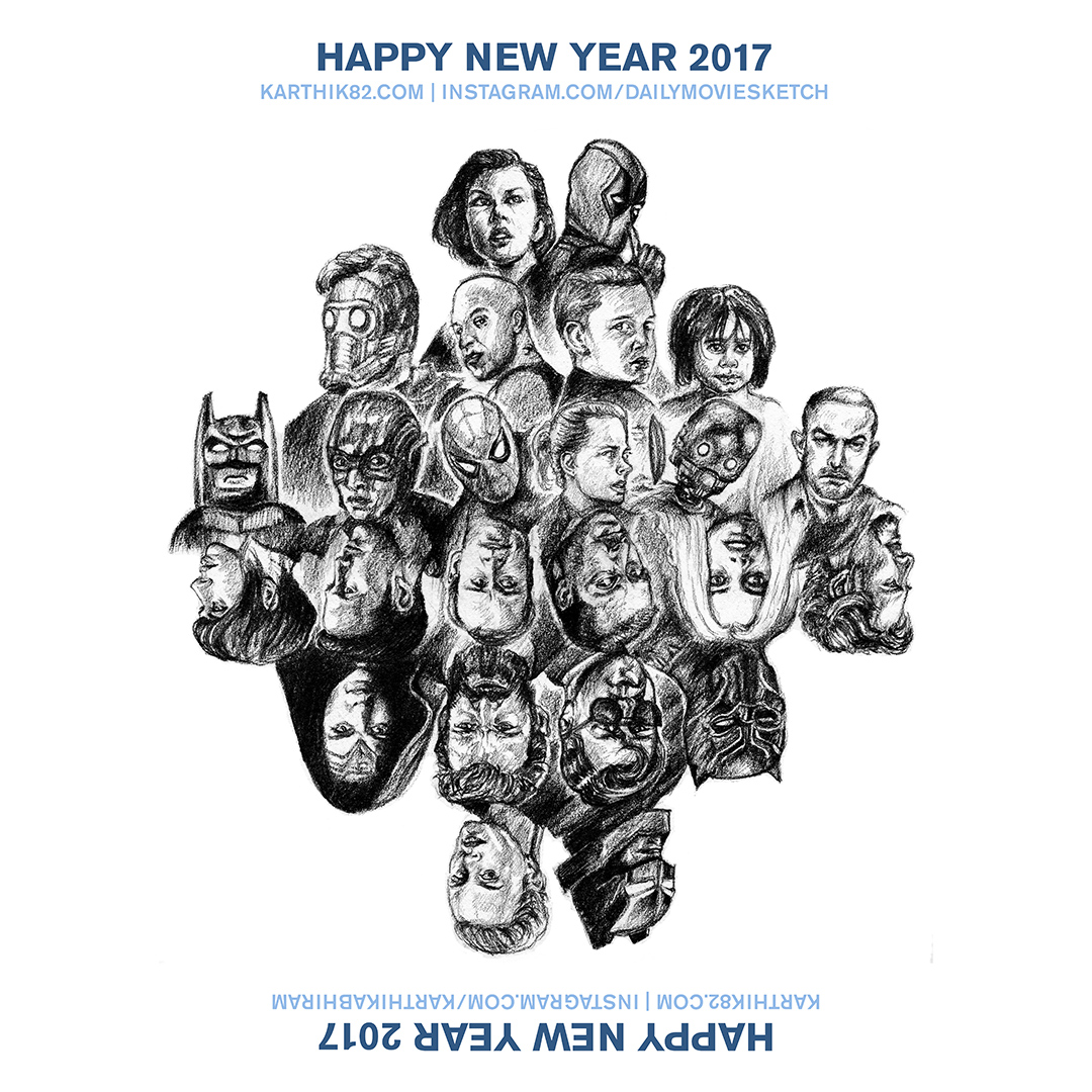 What are the movies represented here? My best of 2016 list is divided into three categories, the best of the best, the very good, and the notable movies. This year, the list includes TV shows as well.
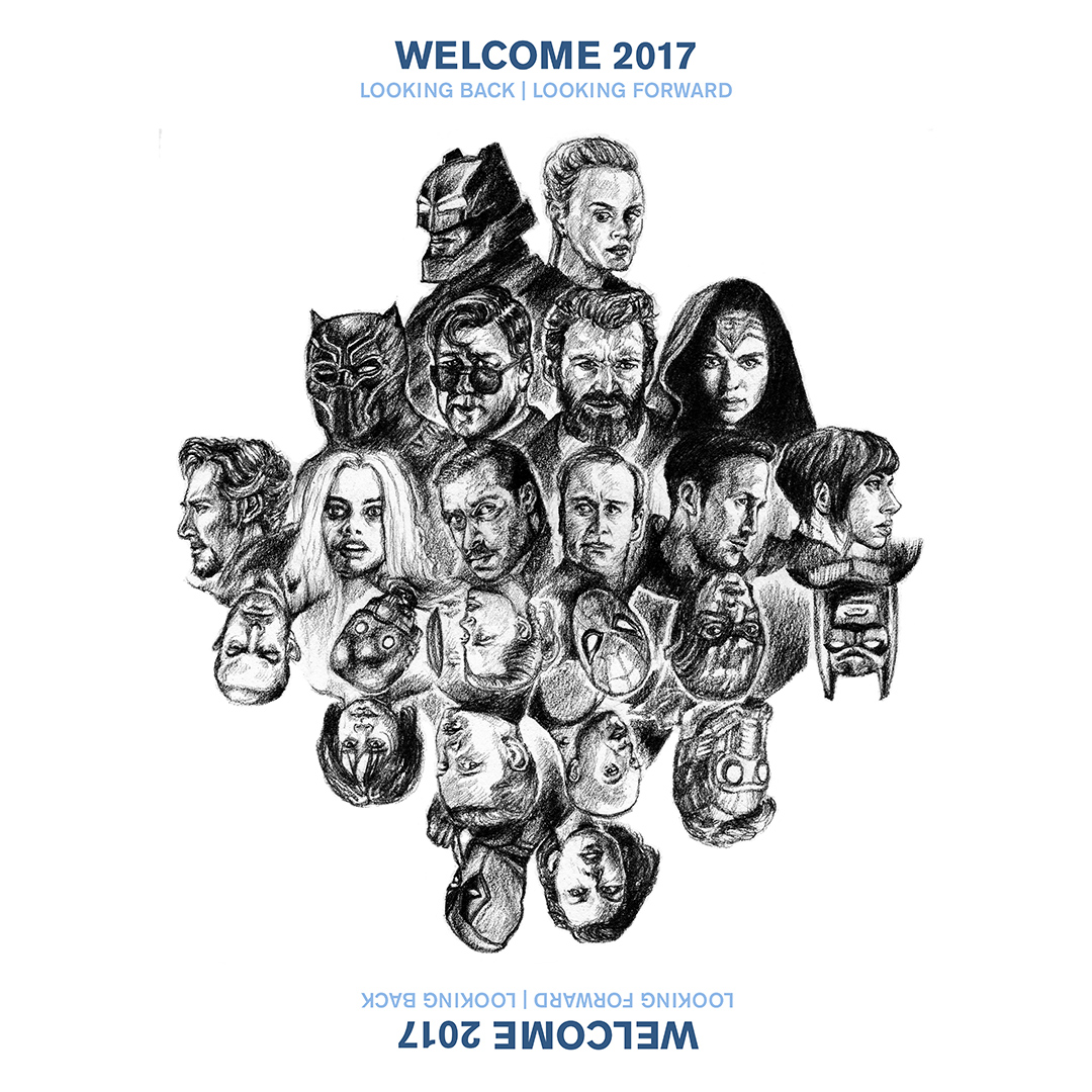 And this is the “upside-down” version –
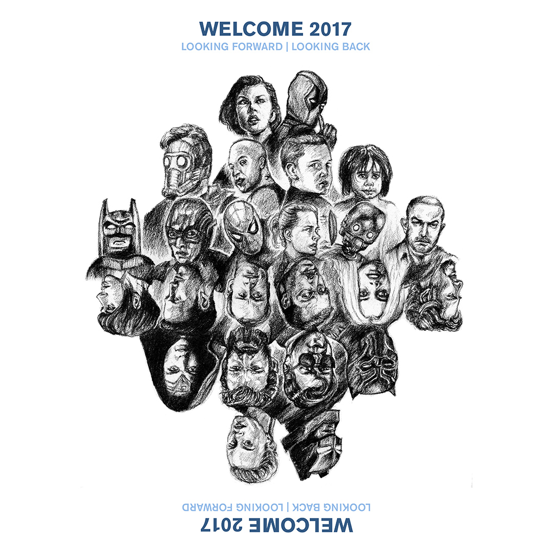 The links where you can view these two artworks are below –